Designing The Daily Scorecard (Part 2)
- Part 2 of How I designed my new-years resolution. Read that first to learn my methodology on how these KPIs were selected in the first place.
Setting up the dashboard
Now that I know what data I want to report, I want to create a “scorecard” that can let me know how I’m doing each day at a glance. To that end, the solution should be:
- Up to date
- I shouldn’t have to manually refresh it to trust that I’m seeing accurate data.
- Accessible
- The dashboard should be visible from everywhere: browser, phone & desktop.
- Quick to see my status
- If you can’t measure it, you can’t manage it.
- I should be able to see within a few seconds how I’m “doing” at a high level. What am I on track on, and what am I behind on, and what needs more attention.
- Measuring my goals in human-friendly units.
- Goals must be stated in pounds, units, calls, boxes — things you can see and touch.
- Percentages are too vague. I can’t visualize “publish 17% more content next week”, but I can visualize “publish one extra article over the next two weeks”.
- Show my history, and if I’m above or below expectation.
- Scorekeeping must offer a comparison between current personal performance, past personal performance, and an accepted standard. Everyday, everybody needs to know whether they are winning or losing.
- Showing history and expectations is the only way I can make sense of what I’m seeing. I need to know how much I should be doing, and then I need to see what I’ve historically done in order to orient myself on what I should be doing next.
- Furthermore, I want to see my ‘momentum’. I don’t just want some abstract feeling of ‘work harder’, I want to think ‘if I do this today and tomorrow, I’m back in the green.’
- Be something I look at every day.
- When people keep their own scorecards, they know whether they won or lost that day and also how much they improved.
- Like getting a score in a videogame, the feedback provides the orientation needed to improve.
- With this in mind, I’ve split the dashboard into two parts: the daily overview, and the detail view.
Daily Overview
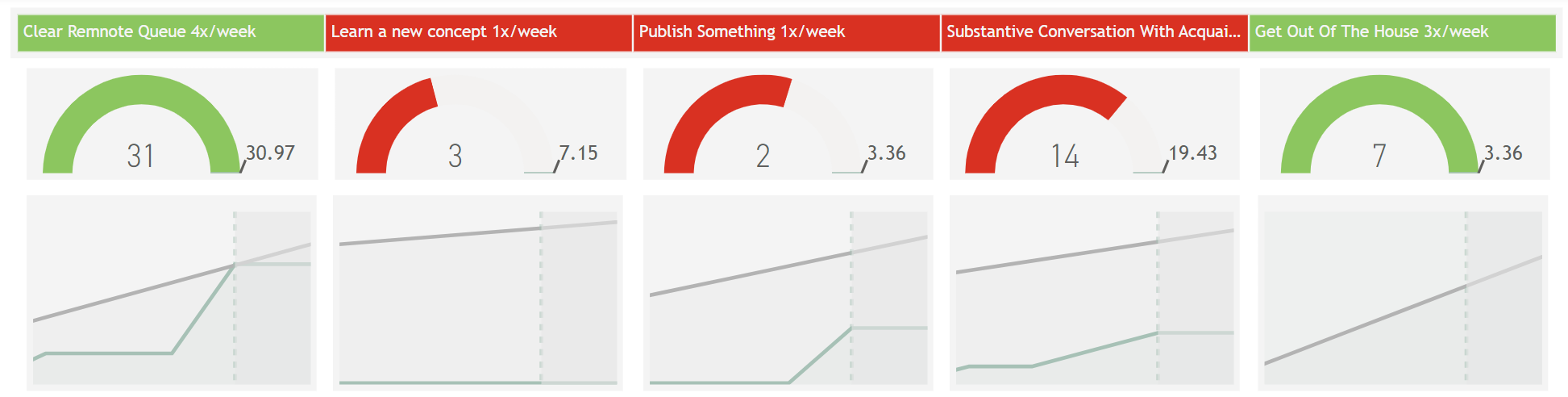
This part is pretty simple by design. For each KPI, I have: Status (Green/Red), a gauge that tells me the degree to which I’m performing (am I slightly ahead/behind, or way ahead/behind), and a graph that shows my activity against the goal line over the last four days.
This gives me enough context to know which KPIs I need to prioritize, and by how much.
I can see my momentum, which lets me know even if I’m in the green that I might need to start working harder on this to stay in the the green.
Something I intentionally decided was that I would not show the total end goals, just my goal for where I should be today.
For example, Get out of the house (OKR: Connectible) has a goal of 3x/week over three months. I could show my progress towards the total goal of 48 instances (3*16weeks), but I felt that that just adds visual clutter.
What I really need to know is simply if I’m on track today. Assuming I am, the end goal will take care of itself.
For example, I might have 5 points towards it as of today. To be on track, the math says my goal today is 5.21 if I want to stay on track. At a rate of 3x/week, the goal only goes up ~0.48 points every day. I know that if I get a point towards it today, I will probably be fine tomorrow as well, which can be motivating.
In the same vein, I added a line graph view that shows my progress against the target, but intentionally restricted it to only show the last four days worth of data.
All that matters is that I can see what I’ve been doing recently, in order to inform what I’ll do next.
What I did three weeks ago is irrelevant, as is what I’ll need to do a month from now. Both can be discarded.
Detail View
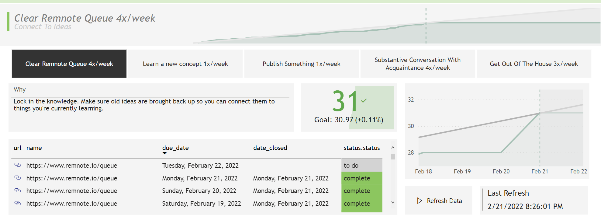
After seeing my overview, I might want to know a bit more about each KPI to determine what my next steps should be.
This view allows me to select each KPI and see:
- The OKR it connects to
- a graph view of my total progress against the total duration of the goal
- a reminder of why I’m doing this (should connect back to motivating Why)
- a tabular view of my historical and queued tasks (with links).
All of these feed back into the core goal of providing context. To feel connected to my goals, I need to know why I’m doing them, where I’m going, and how far I’ve gone.
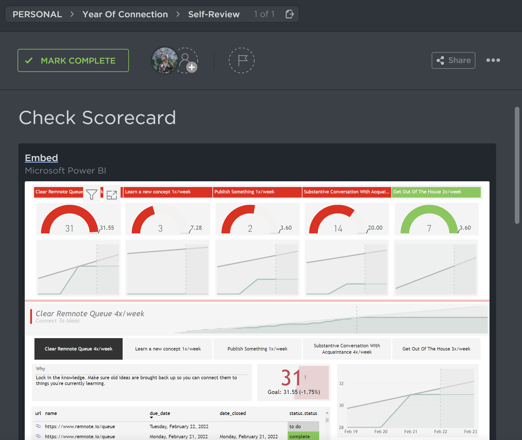
Because of the nature of how I’ll view this scorecard (embedding), I decided to add both of these views to the same sheet to maximize how quickly I can get all the info I need.
Setting up the data source
I track my todo items in Clickup, so I want to use that as a data source. If I check off a task, my dashboard should automatically be updated. I don’t want “keep the scorecard up to date” to be a daily chore, and I want to keep a Single Source Of Truth that my data descends from.
Clickup has a built-in Goals feature, but I found it to be lacking.
- You have no way to define a set goal that’s furthered by tasks. If you set the goal to be task-driven, it just sets it as “100% of the tasks in this list are complete”.
- You cannot embed the Goals view as a tab in your Clickup lists to make them easily accessible. (Which is genuinely surprising, since they allow you to embed nearly anything (Figma, Youtube, iframes) in there.
- Your reporting/visualization capabilities (graphs, guages,etc), as well as your ability to create custom calculations/formulas*, are quite limited (especially for someone that a professional business intelligence developer).
- *(like calculating todays target based on todays date, total goal, and num days we are into the goal).
- Furthermore, your ability to share a dashboard as a digital artifact (public linking, embedding) is highly limited, whereas creating my own solution in PowerBI allows me to embed the viz anywhere I’d like.
I wanted something more flexible, where I can set my goal manually and have each completed task count towards that.
Here’s what I set up.
- I created a folder (titled The Year of Connection) which would contain one list for each of my KPIs
- For each of those lists, I set a start/end date, as well as a description which would be parsed by the dashboard into metrics for each list:

Why =

VAR y = SEARCH("Why:", ClickupKeyResults\[List.content\])

RETURN MID(ClickupKeyResults\[List.content\], y+4, LEN(ClickupKeyResults\[List.content\]))

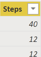
Steps =

VAR x = SEARCH("GOAL:", ClickupKeyResults\[List.content\])

VAR y = SEARCH("OKR:", ClickupKeyResults\[List.content\])

RETURN MID(ClickupKeyResults\[List.content\], 6, y-x-5)
- Then, I set a recurring task in each list. When I close it, it automatically creates a new task due in a few days, while retaining this closed task for historical purposes.
- This allows me to do see the close date of each task to view historical totals for example, which enables my line graphs.
Setting up the daily habit
The way I’ve set things up, all of my goals naturally ‘bubble up’ in my calendar. I might see the ‘go outside’ task due today and decide to work from a coffee shop where I wouldn’t have otherwise. Even if I don’t complete the task today and reschedule it for tomorrow, I’m still thinking about the goal. Instead of getting buried and eventually forgotten like most new-years resolutions, they naturally enter my thinking.
- What gets repeated gets remembered; What gets measured gets managed.
Finally, also have a daily recurring task to view my dashboard. All I have to do is click the task (where I’ve conveniently embedded the dashboard as well), view it for <5sec, then check Complete.
I can do more, but I don’t have to, and that’s the point. For this to be sustainable, it needs to be quick and nondisruptive. It needs to be something so easy I can’t push it to tomorrow. If I see something in the red, I don’t have to fix it right then and there, but it does enter my thinking.
And thinking is all it takes.